Best brand development project to reflect changed mission, values or positioning

Being an affiliate of NAMA, Badiri needed to fulfill its mission as a part of the bigger purpose of NAMA. We needed to develop Badiri’s new strategy and purpose to an extent where it seamlessly integrates with NAMA’s overarching vision of bringing into play all of its affiliates and initiatives to work in unison. Badiri also needed its independent purpose and brand that give it enough autonomy to freely operate and grow.
The key differentiator in the Badiri rebranding exercise was in managing to provide it with a strong and independent purpose, personality, and visual identity; while at the same time finding a solid common ground between Badiri and NAMA, and rationalizing it (dialing up values)
The newly rebranded Badiri Academy is focused, bold yet feminine enough, outspoken yet understated. It voices what it does through its purpose, and communicates to the world through a consistent and visually compelling identity. After streamlining its offerings under clear categories, Badiri’s new brand also made it easier for its audience to discover the Academy’s abundance of programs and make the right choice when registering for one or more.

Best implementation of a brand development project

The objective was to develop a salient brand that underlines the efforts of Badiri, as well as speak with women entrepreneurs and engage them. The exercise took us and the client as far as revisiting the naming nomenclature, and the programs offering architecture.
With the new purpose in mind, we developed an outspoken verbal and visual identity where all the elements expressed proactivity and explicit calls for action. Visually, graphic devices illustrated forward movement in an upward stepped manner, projecting development and thriving.

Best use of a visual property

Illustrating a Badiri brand that constantly moves forward had to project a clear impact, a positive result of that moving forward. We found our inspiration in the logo itself. We extracted the shapes and called them the “Waves of Success”. These waves, supported by the verbal expression, had to inspire the audience to take the next step toward success.
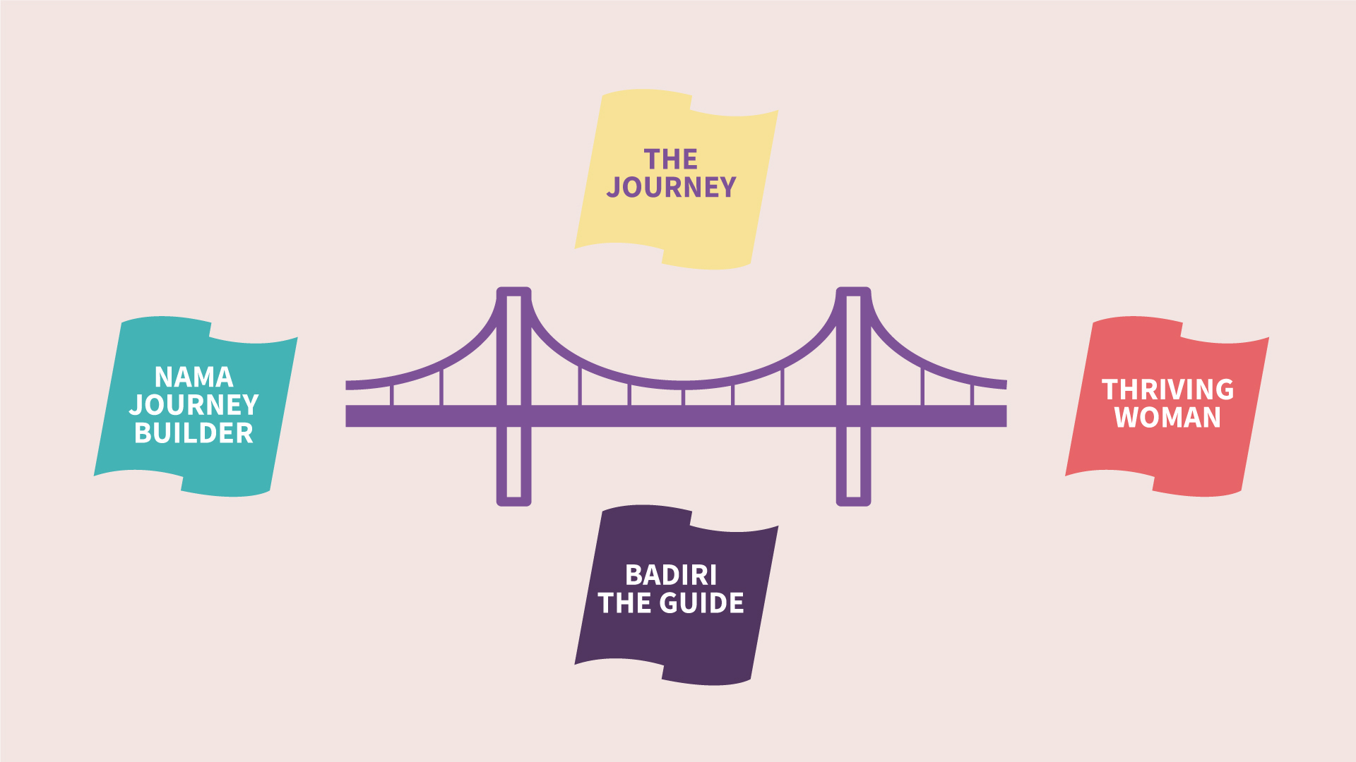
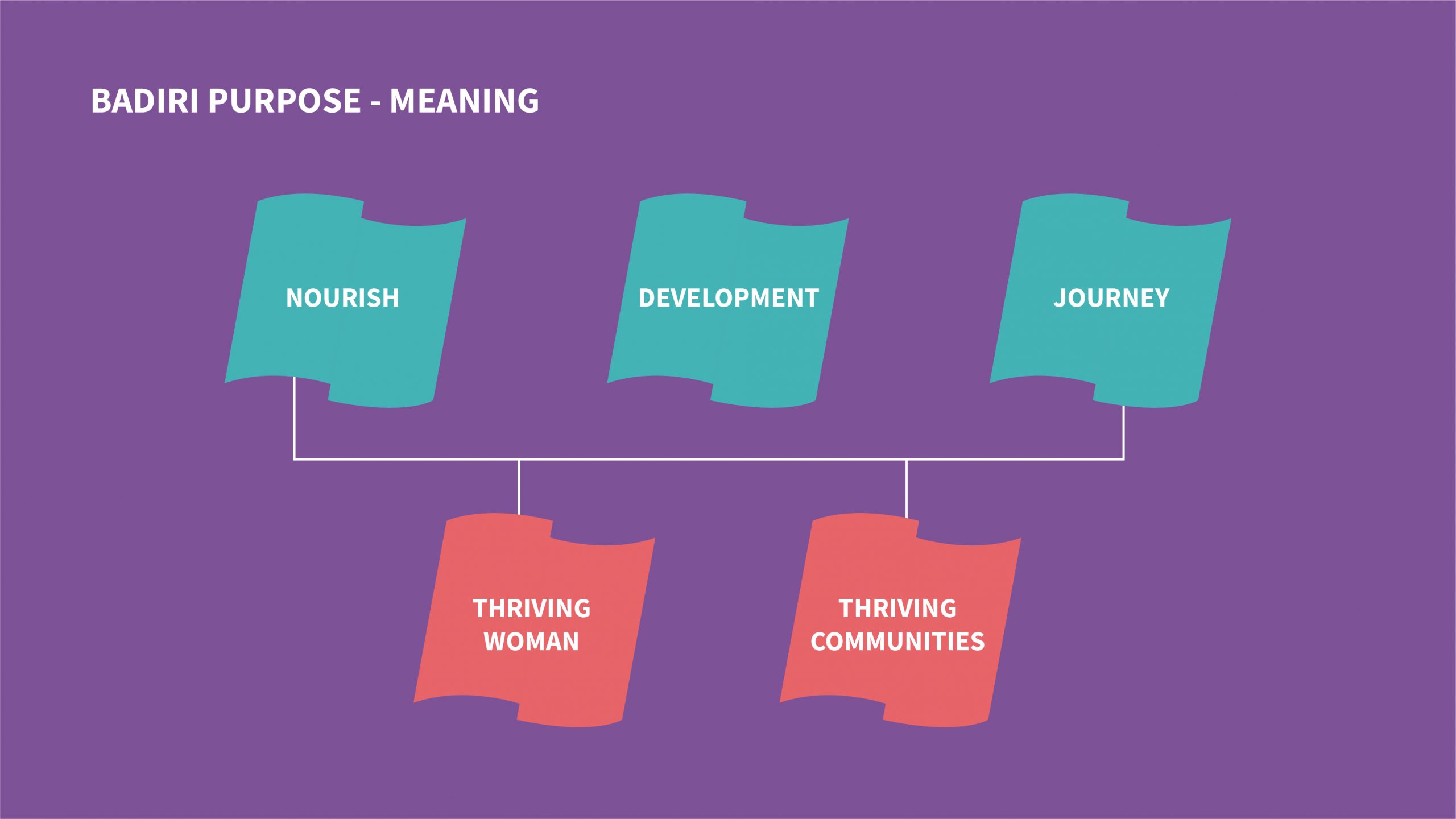
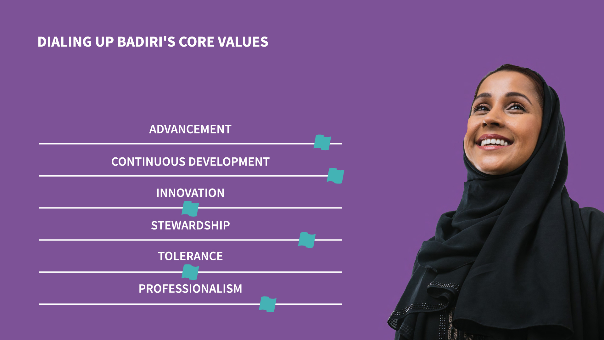
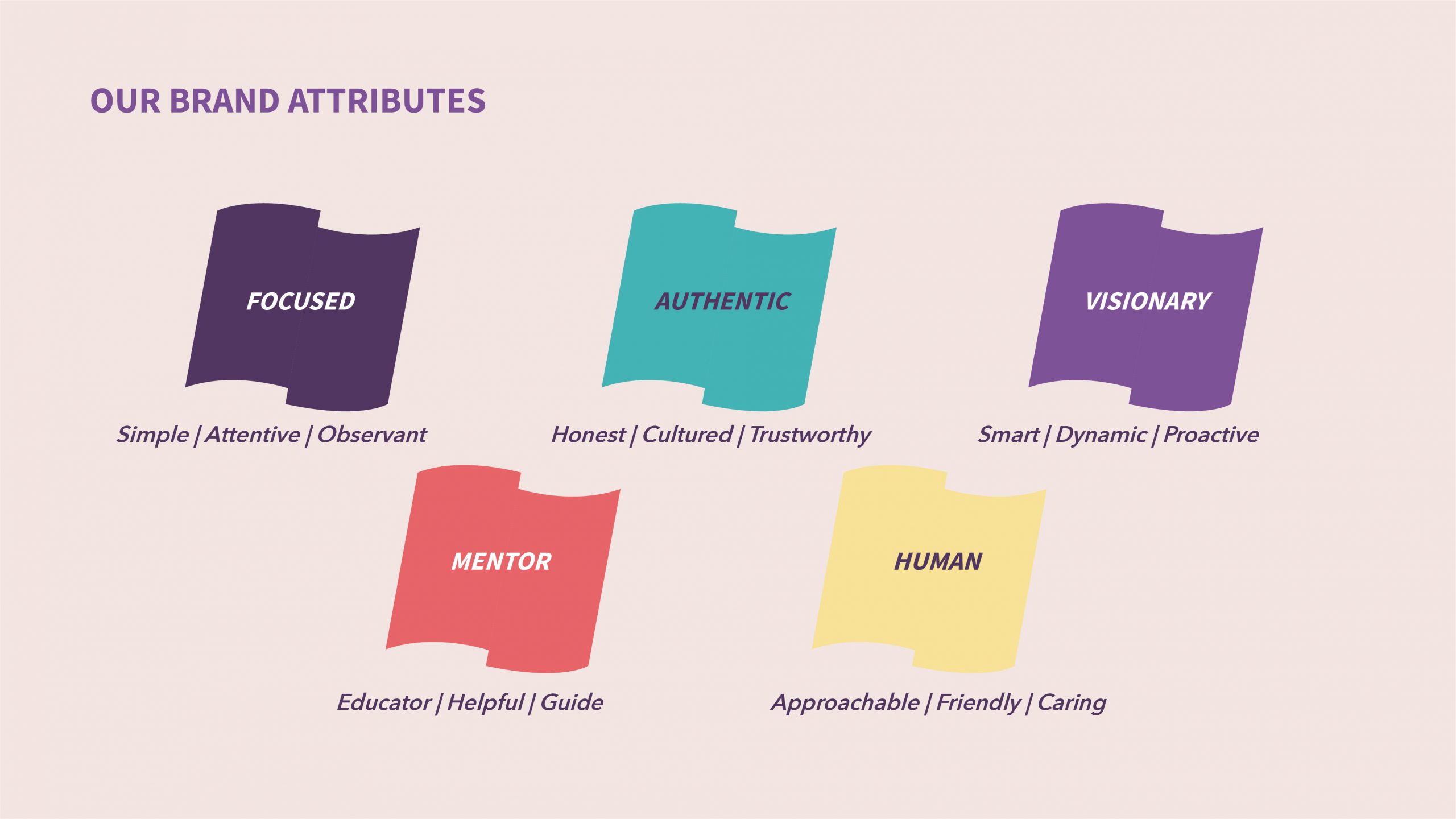
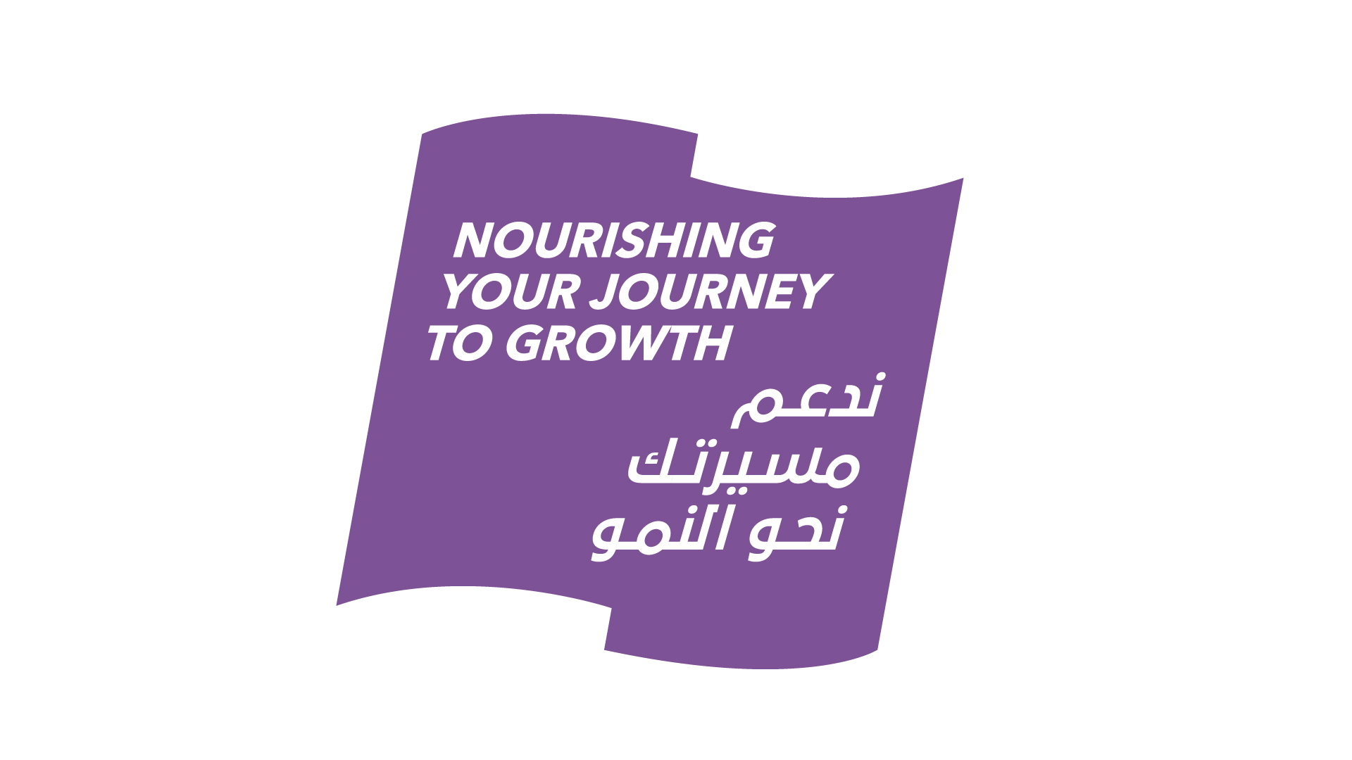
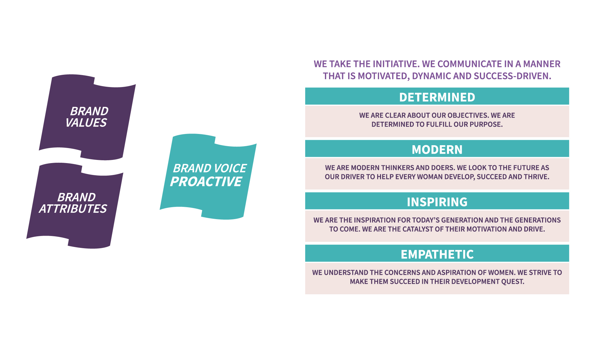
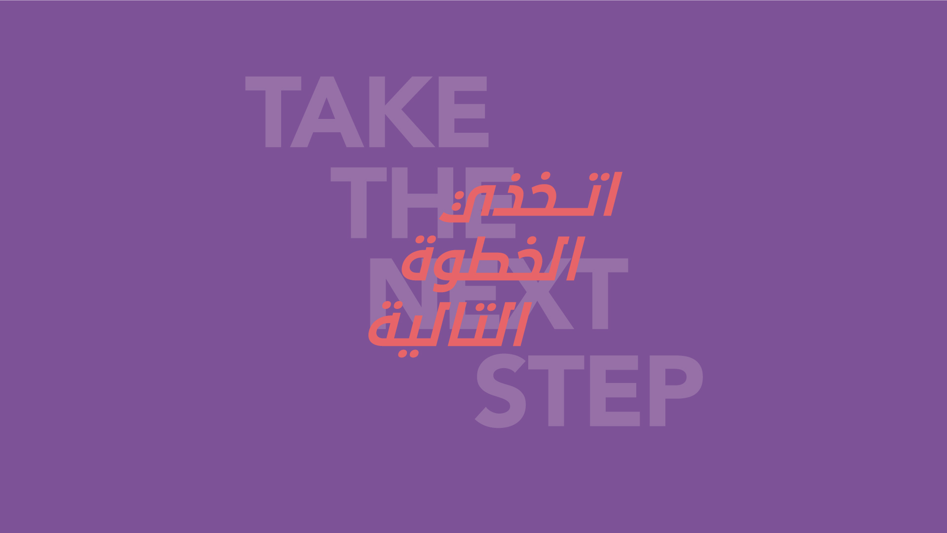
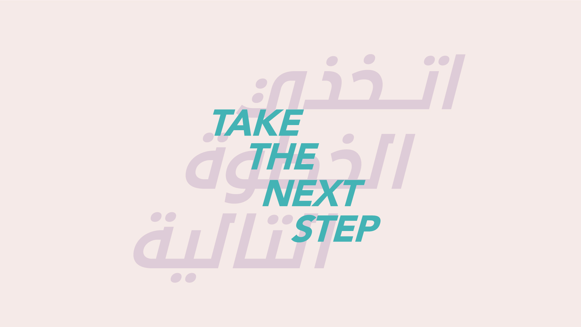
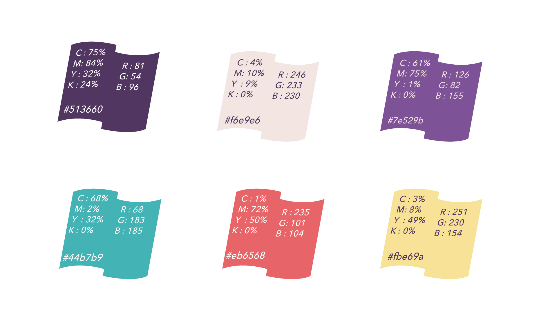
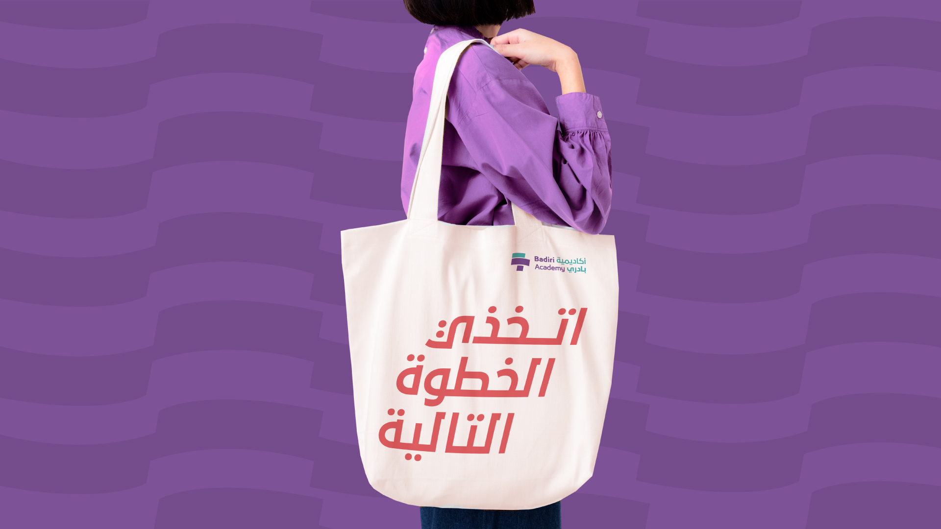
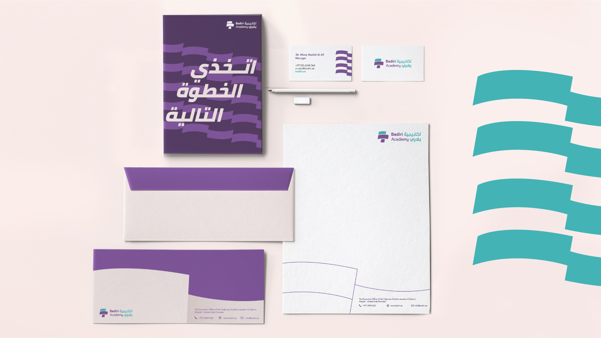
The “waves of success” display two levels or more, always signaling the idea of constantly and successfully moving forward. They are dynamic, avoiding static representations. Supported by a smart and vibrant color palette, bold and daring typography, and photography that inspires human growth, the shapes acted as triggers, but also as complements to the overall visual.

Best use of copy style or tone of voice

The task of developing a stronger brand that reflects the true efforts undertaken by the NAMA affiliate entailed revisiting Badiri’s way of expressing itself externally, by seamlessly integrating its tone of voice within its newly developed identity. The new tone of voice had to be explicit, aspirational, and engaging. It also needed to clearly illustrate Badiri’s call for action.
Badiri speaks to a young generation eager to develop and prosper, a generation looking for guidance and inspiration. It had all the necessary ingredients to do so. All that Badiri needed was the right way of expressing its commitment. The implementation of the new Badiri tone of voice resulted in promoting and communicating a much more assertive and committed brand, one that can be heard loud and clear, and that connects with its audience on functional and emotional levels.

Best use of typography

For Badiri to be pertinent in its messaging, typography played a central role in shaping the statements. We had to choose fonts families that could guarantee the message is visible and understandable. We also needed fonts that amplify the meaning of the message through the way typography is represented. Finally, we needed typography that helps Badiri stand out from the crowd.

The typography needed to be able to work on multiple “steps” levels, sometimes stretching up to more than 4 levels. The Latin “Avenir Next” and Arabic “Bukra” typefaces were chosen because of their abilities to stretch in multiple steps without looking distorted or out of context.

This chosen typefaces treatment creates an association with the general concept of the visual identity and reminds viewers of the idea of levels and that they need to climb upwards to reach their success milestones. Complementing the verbal manifestation of Badiri, the typefaces helped assert the power of the message, working with graphic devices and colors in perfect symbiosis to magnify the message of Badiri.

Best Visual Identity in Charity, NGO or not-for-profit

Brand Lounge was tasked with the rebranding of Badiri, including redefining its visual identity based on the new purpose. The goal was to develop a salient brand identity that communicates the mission of Badiri and engages with women entrepreneurs. The new visual identity had to stand out from the crowd, and position Badiri as a leader in the category.
The new logo symbol was designed to highlight the “steps” that women take to reach success and thrive. Stressing on language diversity, we combined the Latin “B” and Arabic “Ba” in a shape that symbolizes a torch, a sign of enlightenment, success, and achievement. The logotype also follows suit, where both Arabic and Latin are placed together in a way that also highlights the steps.

Badiri Academy is now a focused brand, bold and feminine at the same time, outspoken, and with clear messaging. It voices a pertinent purpose and communicates to the world through a consistent and visually compelling identity. Badiri’s new brand is now easier to understand by its audience and the market at large. It is now visually appealing with graphic devices and a color palette that is simple to connect with and remember.

Badiri’s brand is now visually appealing with a graphic device that promotes a better connection with the brand, and a better understanding of how it can help women ascend to achievers’ levels.